Events
Fall Issue Update
An all-star cast assembled for the fall issue — poetry, short stories, photography, and an interview with a jazz musician from Minneapolis, MN.
Read More →An Artistic Journal · Est. October 2011
A quarterly publication — online and in print — joining poets, photographers, painters, storytellers, and musicians into one open forum for cross-cultural expression.
An artist’s choice of drawing medium often begins with touch rather than theory. Graphite offers a controlled, familiar line, while charcoal responds with a softer drag, a heavier deposit of black, and a surface that seems to breathe beneath the hand. The difference is visible in the finished work, yet it is also physical: each material encourages a different pace, pressure, and way of looking.
For many artists, charcoal is less about accuracy than presence. It can describe a cheekbone with a single stroke, suggest a storm through rubbed powder, or make a blank page feel charged before the image is complete. Its marks retain evidence of movement, giving a drawing the energy of an event rather than the polish of a solved problem.
That appeal matters in Australia, where strong sunlight, expansive distances, and dramatic shifts between built and natural environments provide endless subjects. A Melbourne studio in winter, a life-drawing room in Brisbane, or a landscape outside Hobart can all invite a material capable of moving quickly between delicacy and force.
Graphite is made from crystalline carbon mixed with clay, which gives it a relatively precise and stable character. Pencils arrive in graded hardnesses, from pale, crisp H leads to rich, soft B grades. The artist can build tone through hatching, cross-hatching, blending, and carefully controlled pressure. A sharp point records detail with remarkable discipline.
Charcoal behaves more like a fragment of fire than a manufactured instrument. Vine charcoal is light, friable, and easily lifted, while compressed charcoal is denser and darker. Charcoal pencils provide a degree of control, but even they produce a less predictable line than graphite. The powder catches in the tooth of the paper, skips across ridges, and leaves a trace of the artist’s physical movement.
This resistance to complete control is a central attraction. A charcoal stroke can be broad enough to describe a shoulder, then turned on its edge for a narrow contour. A graphite pencil tends to preserve the identity of the line; charcoal can dissolve it into atmosphere, shadow, or gesture.
Artists frequently choose charcoal when they want to work at the speed of perception. In a portrait session, a few sweeping marks can establish the tilt of a head and the weight of a body before the pose changes. The medium supports a whole-arm movement, especially on large paper fixed to a wall or easel. This scale can make the act of drawing feel closer to choreography than writing.
The eraser becomes an active tool rather than a device for correcting mistakes. Kneaded erasers can pull light from a dark field, creating highlights in hair, fabric, or cloud. A rag, chamois, or fingertip can soften an edge, while a fresh charcoal line can restore structure. The image develops through subtraction as much as addition.
That process has an emotional dimension. A charcoal drawing often shows hesitation, pressure, erasure, and return. Viewers may sense the time inside the image because the surface records decisions openly. The expressive power resembles the way a dancer’s body reveals intention through line and form, a subject explored in a dancer’s visual language.
Charcoal is especially effective when an artist is thinking in masses rather than outlines. It can establish a near-black quickly, allowing mid-tones and highlights to be judged against a strong tonal foundation. This is useful for dramatic interiors, nocturnal scenes, weathered faces, and landscapes where the sky occupies most of the composition.
Australian light can make this approach particularly compelling. The hard brightness of an Adelaide afternoon, the humid haze around Darwin, or the silvery weather of the Victorian coast produces complex relationships between glare and shadow. Charcoal can hold those extremes without forcing every detail into a descriptive line. A few erased passages may suggest sun bouncing from corrugated iron or a pale track receding through scrub.
Texture also carries local associations without becoming illustrative. Dry charcoal can echo dust, bark, stone, ash, or the rough grain of an old fence. On heavyweight cotton paper, the marks remain tactile; on newsprint, they become quick and provisional. Choosing the surface is therefore part of choosing the image’s voice.
The decision between the two materials depends on the artist’s subject, working habits, and desired finish. Graphite is often the better fit for precise botanical studies, architectural detail, small illustrations, and drawings that must travel safely with minimal smudging. Charcoal excels when gesture, atmosphere, tonal drama, and visible process are central.
| Consideration | Charcoal | Graphite |
|---|---|---|
| Mark quality | Broad, powdery, expressive, and varied | Precise, linear, and controlled |
| Tonal range | Reaches deep blacks quickly | Builds darks gradually |
| Erasing | Creates highlights and active revisions | Corrects or lightens with greater precision |
| Best scale | Medium to large drawings and studies | Small details through to refined large works |
| Surface | Needs tooth to hold the particles | Works across many smooth and textured papers |
| Handling | Smudges easily and often needs fixing | More stable and portable |
| Visual mood | Immediate, raw, atmospheric | Observational, exact, and measured |
Cost and presentation also influence the choice. In the Australian art market, framing a large charcoal work behind suitable glazing can become a substantial expense, particularly in Sydney or Melbourne. Archival fixative, protective interleaving, and careful courier packaging add to the practical demands. Graphite usually offers an easier route for artists producing small works for markets, open studios, or online sales.
Still, the extra care required by charcoal can reinforce its physical impact. A work that needs space, protection, and considered lighting may command a different kind of attention in a regional gallery, artist-run space, or contemporary art fair.
Charcoal invites risk because it can be changed so quickly. A dark passage can be pushed into the background, broken apart with an eraser, or partly removed with a cloth. The artist is able to test relationships without committing every decision permanently. This is valuable during exploratory stages, when a drawing must discover its subject rather than simply reproduce it.
Graphite encourages patience and accumulation. An artist may spend hours adjusting a value by small degrees, preserving a clean surface as the image grows. That discipline can produce extraordinary subtlety, yet it may also encourage over-refinement. Charcoal interrupts that tendency. Its unstable surface makes it harder to hide behind detail.
The medium is well suited to subjects that resist direct explanation. A face altered by grief, a body remembered imperfectly, or a landscape carrying historical tension may require ambiguity. In such cases, the unfinished edge can be more truthful than a fully described contour. This is one reason charcoal often appears in work about memory, absence, and the limits of language, including the concerns examined in lyric poetry and trauma.
Material choices communicate before viewers interpret subject matter. The black dust of charcoal suggests combustion, age, soil, and bodily residue. Its history as a drawing material reaches back to cave walls and early image-making, yet it remains contemporary because it can be handled with speed and force. An artist may choose it precisely because the medium feels elemental.
That symbolism can be subtle. Charcoal may suit a series about bushfire aftermath without functioning as a literal reference to burnt timber. It can give a family portrait a sense of vulnerability, or make an urban scene feel temporary and unstable. The association arises through texture and tone rather than an obvious message.
Photography and drawing can share this sensitivity to passing moments. A visual diary of a small-town parade, such as the one described in a photographer’s parade study, relies on observation, rhythm, and the details that disappear when an event is over. Charcoal offers a comparable way to hold fleeting gestures: a flag caught by wind, a child turning away, or a crowd dissolving at dusk.
Choosing charcoal does not mean abandoning graphite. Many artists use both, allowing the materials to define different stages of their process. Graphite may establish a delicate map, charcoal may deepen the primary forms, and white pastel or eraser work may bring selected passages forward. Others keep the media separate so each body of work maintains a distinct visual logic.
A practical studio routine helps. Use a range of charcoal types, test papers before beginning a major drawing, and keep a soft brush nearby for controlled removal. Fixative should be applied cautiously and in ventilation, since excessive spray can alter the surface and darken delicate passages. Works intended for sale need archival paper, protective tissue, and packaging that prevents abrasion.
Artists developing a portfolio can consider the following working principles:
For Australian artists, a charcoal series may find a natural home in the country’s diverse exhibition culture, from community galleries in regional New South Wales to independent spaces in Naarm and artist-led projects in Perth. Digital publication also allows work made far from major centres to enter international conversations. The open, cross-disciplinary spirit of Moratoria Mu reflects how visual artists can move between forms, places, and communities without treating medium as a boundary.
A successful charcoal drawing does not need to look rough, and a successful graphite drawing does not need to look restrained. The important question is whether the material supports the kind of attention the image demands. Charcoal is often chosen when the artist wants the viewer to feel the pressure of the hand, the instability of memory, or the atmosphere surrounding a subject.
For artists ready to share that kind of work, Stone Path Review’s current issues provide a setting where drawings can sit alongside writing, photography, music, and other forms of creative practice. Submit a charcoal study, a finished series, or a reflective essay on the marks that shape your way of seeing.
Identity & Recognition
Featured Book
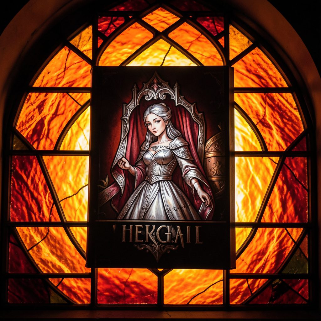
Selected works from across our quarterly issues, gathered into a printed volume. Past print runs have appeared in limited quantities and are available while supplies last.
Volumes cover poetry, short fiction, photography, paintings, drawings, reviews, and interviews — curated to reflect the breadth of artists who have shared their paths in the journal.
Browse Past IssuesInside the Pages
Since 2011, Stone Path Review has hosted contributions from more than twenty artists — poets, photographers, musicians, and filmmakers — along with interviews, readings, and film entries.
Recent volumes have included poetry from Mark Doty and Jim Harrison, an interview with a jazz musician from Minneapolis, MN, and the short film Efflorescence from Deep Field Cinema.
From the Blog
An all-star cast assembled for the fall issue — poetry, short stories, photography, and an interview with a jazz musician from Minneapolis, MN.
Read More →
A featured film entry from Deep Field Cinema, programmed as part of our ongoing screen series.
Read More →
418 Publishing, Inc. was started as the parent company of Stone Path Review, with five issues published by this point.
Read More →
Photography and artist interview, part of an ongoing series highlighting new and established contributors.
Read More →
A recorded poetry reading captured on video and shared alongside the print issue.
Read More →
Browse past quarterly issues of Stone Path Review, available online with limited print quantities.
Read More →