Events
Fall Issue Update
An all-star cast assembled for the fall issue — poetry, short stories, photography, and an interview with a jazz musician from Minneapolis, MN.
Read More →An Artistic Journal · Est. October 2011
A quarterly publication — online and in print — joining poets, photographers, painters, storytellers, and musicians into one open forum for cross-cultural expression.
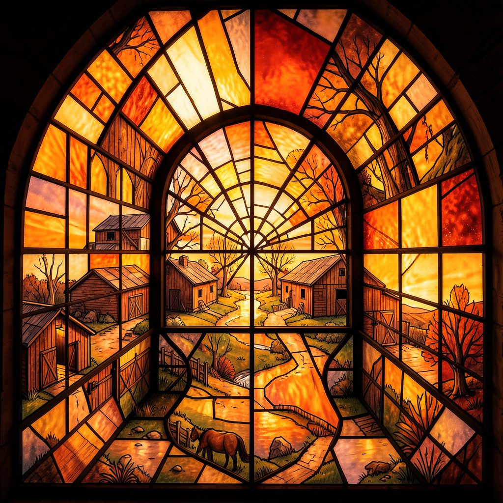
A sheet of paper rarely behaves like a pedestal, yet it can become a meeting place between the tactile instincts of a sculptor and the projected space of a drawing. A sculptor asks where weight will settle, how a surface will catch light and which edge can be entered by the eye. A page asks how those conditions can be made visible without pretending that ink has mass.
The central problem is not how to make a three-dimensional object look convincingly real on paper, but how bodily volume, gravity and depth can be conceived within a flat support. It is explored through contour, interval, overlap, shadow and scale. Each acts like a hinge between the imagined object and its image. These reflections treat drawing as an active rehearsal: a way to test balance, anticipate movement and carry spatial intelligence into other media.
A sculptor can begin with an empty volume rather than a visible object. Clay waits in a block; a wire armature describes the space it may occupy; a carved void can be as substantial as the wood surrounding it. On paper, the equivalent begins with the rectangle itself. Its edges establish a field, and a few marks can turn that flat boundary into an implied room.
Volume becomes legible when contours press against one another. A widening shape suggests weight, while a narrow gap can create pressure between two forms. The white page is not simply leftover background; it may be the open side of a form, the air between limbs or the negative shape that holds a composition together. Treating emptiness as material changes the drawing from an outline exercise into a spatial one.
Mass is communicated less by literal size than by the behaviour of marks. Dark passages can acquire visual weight, and a tilted base can make a shape appear to lean. A small maquette examined from above, below and the side teaches a sculptor to understand which angle contains the strongest tension. A successful drawing does not catalogue every surface; it chooses the view that lets depth, gravity and balance remain perceptible.
The published reflection on line and form offers a useful parallel with dancers, whose bodies turn balance, pathway and relationship into visible duration. A drawn line can carry the same qualities. It may gather speed, hesitate, support the form or cut across it. To draw is to record not merely the edge of an object but the route by which the eye believes that object has been made.
Gesture gives the page a time-based quality. A contour made in one uninterrupted movement preserves pressure, hesitation and acceleration. Blind-contour studies make this explicit because the artist cannot rely on a fixed view. Thick charcoal behaves like a loaded thumb; fine ink records a narrower, more exacting gesture. Both reveal how an arm, wrist and breath can stand in for the sculptor’s imagined body.
Movement also belongs to the viewer. A drawing can indicate that a form continues beyond the visible edge, or that a path runs behind it. Artists sometimes fold a sheet, tape it at the corners or work on separate pieces to test how perception changes with orientation. The page remains flat, but the act of making can circle the object, approach it and withdraw.
Shadow is a sculptural event because it has direction, density and a life beyond the object casting it. Raking light strengthens a ridge or makes a depression legible; overhead light produces a different spatial reading. On paper, the shadow can be described with tone, but it can also be left as an active absence, bounded by the few marks needed to imply its source.
Examples of vertical compositions created for smartphone wallpapers make a related point about format. A tall image encourages the eye to travel, while the narrow boundaries demand decisions about what can be withheld. For a sculptor working with the page, height can suggest a standing figure, a tower, an upright stone or a slice through an installation. The proportions of the support become part of the spatial idea.
Sydney’s harbour light offers a particularly clear lesson in this respect. Water and glass return shifting bands of brightness, while the hard noon sun creates brief, graphic shadows. These conditions reward close observation of edge and interval. A drawing made from such observations does not copy a scene mechanically; it translates the pressure of light into the flat language of density, contour and reserved paper.
An installation exists over time. The viewer approaches, turns, pauses and sometimes discovers that a new alignment changes the work. A drawing can suggest such a route through overlapping shapes, changes of scale and shifts in viewpoint. An arrow, a shadow or a receding edge may function less as depiction than as evidence that space continues outside the frame.
Perspective offers one vocabulary, but a sculptor’s thinking often exceeds a single optical position. Plan, elevation and perspective can be placed beside one another, each correcting the other. A shape seen from above may intrude upon a figure seen from the front. These purposeful inaccuracies record thought in progress and preserve information that one tidy viewpoint would lose.
The physical page also has a surface identity. It can buckle, fray, crease or reflect light. A sewn sheet, a deep mount or a narrow frame changes the distance between image and object. The result is not a sculpture reproduced on paper but a hybrid: part drawing, part relief and part invitation to move. Its apparent flatness becomes the very condition that activates the viewer’s sense of depth.
Translation works best when the drawing investigates the same spatial problem as the object rather than copying its appearance. The following sequence can help artists move between sculpture, painting, photography and printmaking while preserving the intelligence of three-dimensional practice:
Keep the process exploratory rather than photorealistic. The purpose is not to make a drawing that impersonates an object, but to discover what the object can do once it has entered the imagination of a reader. Graphite, torn paper, pigment and pixels can all carry pressure, interval and direction; what matters is that these choices answer the same spatial question.
Australian creative work is often encountered through open studios, community exhibitions and weekend design markets rather than through a single grand gallery circuit. Melbourne’s laneway studio culture, including public open-studio events, gives visitors an informal way to encounter work at different stages. Stall fees, limited editions, commissions and direct sales are commonly discussed in Australian dollars, with GST affecting many transactions.
Material weather also alters the way artists think about form. Brisbane’s humidity can slow the drying of clay and encourage testing in porous or mixed-media surfaces. Farther south, Adelaide’s dry, hot winds may cockle thin paper and shift the behaviour of ink or watercolour. These are not obstacles to be edited out of a sculpture; they are constraints that can deepen attention to surface, joining and vulnerability.
Along the coast, Fremantle’s salt-laden air can alter metal and change the rate at which patinas develop. A bronze or steel study may therefore need different protection from the same conceptual object kept inland. Such conditions make an Australian studio practice attentive to place. The page can record these environmental negotiations without becoming a literal landscape, translating climate into weight, erosion and tonal contrast.
Published by 418 Publishing, Inc., the nonprofit Stone Path Review is an artistic quarterly that brings poems, stories, essays, reviews, photography, painting, drawing, music and video into one cross-cultural forum. Its print and online editions make the journal a fitting place for a drawing that carries sculptural thinking, since both publication and sculpture depend on the encounter between material, space and attentive looking.
Artists and readers can participate by submitting work without reading or submission fees, by studying how another discipline handles form, and by offering a response that crosses genres. Bring the physical logic of your work into a new two-dimensional study, then share that study, essay or creative piece with Stone Path Review for its next quarterly gathering.
Identity & Recognition
Featured Book
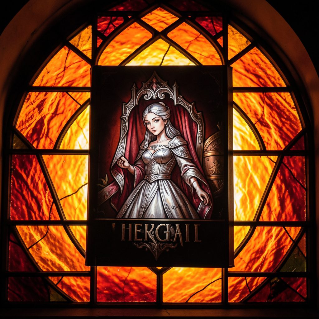
Selected works from across our quarterly issues, gathered into a printed volume. Past print runs have appeared in limited quantities and are available while supplies last.
Volumes cover poetry, short fiction, photography, paintings, drawings, reviews, and interviews — curated to reflect the breadth of artists who have shared their paths in the journal.
Browse Past IssuesInside the Pages
Since 2011, Stone Path Review has hosted contributions from more than twenty artists — poets, photographers, musicians, and filmmakers — along with interviews, readings, and film entries.
Recent volumes have included poetry from Mark Doty and Jim Harrison, an interview with a jazz musician from Minneapolis, MN, and the short film Efflorescence from Deep Field Cinema.
From the Blog
An all-star cast assembled for the fall issue — poetry, short stories, photography, and an interview with a jazz musician from Minneapolis, MN.
Read More →
A featured film entry from Deep Field Cinema, programmed as part of our ongoing screen series.
Read More →
418 Publishing, Inc. was started as the parent company of Stone Path Review, with five issues published by this point.
Read More →
Photography and artist interview, part of an ongoing series highlighting new and established contributors.
Read More →
A recorded poetry reading captured on video and shared alongside the print issue.
Read More →
Browse past quarterly issues of Stone Path Review, available online with limited print quantities.
Read More →