Events
Fall Issue Update
An all-star cast assembled for the fall issue — poetry, short stories, photography, and an interview with a jazz musician from Minneapolis, MN.
Read More →An Artistic Journal · Est. October 2011
A quarterly publication — online and in print — joining poets, photographers, painters, storytellers, and musicians into one open forum for cross-cultural expression.
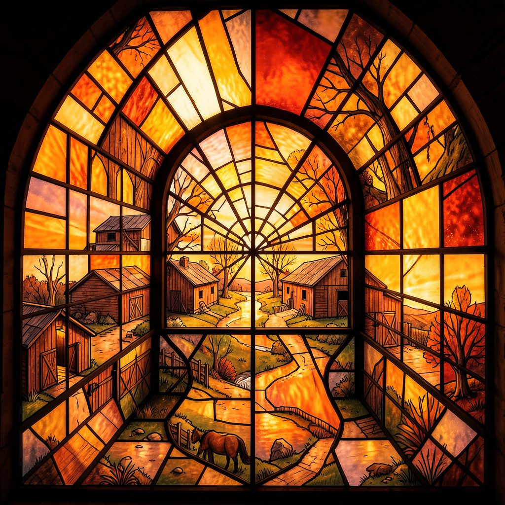
Mapmaking is a form of artistic attention: it chooses a place, sets relationships in motion and gives another person something to discover. In Stone Path Review’s quarterly pages, drawings and maps can stand beside poems, photographs, essays and films, revealing how spatial stories connect creative traditions across cultures. A useful map does more than locate a building or trace a river; it makes a way of seeing feel shareable.
Artists around the world use maps to explain neighbourhoods, preserve journeys, question official descriptions and turn private routes into public knowledge. Their choices expose the art’s central tension: clarity can simplify, while richness can overwhelm. For an Australian audience, familiar ferries, cycling corridors, laneways and disputed developments place those choices close to ordinary life. Learning from mapmaking therefore means examining how geography becomes narrative, and how a narrative can change the way a place is understood.
Every map contains an argument. A boundary line favours one administrative division over another; a bright marker can make one destination feel more important than its surroundings. The legend directs attention, while scale and framing determine what can be seen at all. Even a simple hand-drawn sketch carries judgments about distance, priority and value. Reading these choices critically turns mapmaking from a mechanical task into an ethical and creative practice.
Official maps and artistic counter-maps can therefore disagree without either being merely decorative. Survey maps support navigation and administration, whereas artists reveal informal paths, forgotten names and lived rhythms. In Canberra, the National Library of Australia’s map collection offers a glimpse of this layered history, from colonial exploration to contemporary planning. Many Aboriginal cultures also hold sophisticated spatial traditions, so a respectful artistic map should acknowledge that no single mapping system holds all geographical knowledge.
A symbol is a compact instruction. A bridge on a transit diagram means something different from the same shape in a flood plan, and colour can signal danger, welcome or institutional authority before a reader reaches the key. Good cartographic design treats symbols as part of a visual grammar: recurring shapes, line weights and labels should behave consistently, while distinctive features deserve emphasis. The aim is not sameness but a language that can be learned without confusion.
Place names add another layer, carrying associations that survive changes in streets or councils. Melbourne’s laneways demonstrate how unofficial markings, murals and temporary signs can operate as a living counter-map, layered over the city’s official grid. These details invite slow looking and careful recording. They also matter emotionally: a hand-lettered footpath or shop sign can make a neighbourhood legible in ways a standard direction sign never will.
Digital maps promise instant directions, yet walking still supplies the knowledge that an interface cannot. Sydney ferry commuters notice which ramp is steep, where the wind cuts across a platform and when a shortcut through a park actually saves time. A sketchbook makes room for that uneven experience. Stone Path Review’s account of urban sketching practice shows how observation becomes both record and interpretation, rather than a detached inventory of façades.
Slow fieldwork can reveal what a grid compresses: a creek under a bridge, the changing scent of a bakery, a public seat positioned for afternoon sun. A neighbourhood walk beside Brisbane’s creeks can reveal flood history through landmarks that official documents express as elevations and drainage lines. Translating those observations into a map preserves practical memory and invites outsiders to notice relationships that are otherwise easy to miss.
Scale changes the emotional weight of a place. A continent-wide atlas can make a city disappear; a close-up street plan can make a vast migration or climate system disappear. Cartographers use projection and distortion to manage these tensions, and artists add another negotiation through cropping, collage and sequence. The useful question is not whether a map is accurate in every detail, but whether its chosen accuracy serves its declared subject and audience.
Labels deserve particular care because they guide recognition and judgement. A ramp shown on an accessibility map can connect a traveller to a destination, while vague categories can erase the conditions people actually encounter. The stakes of representation are visible in wider discussions of disability and criminal reporting, where descriptions frame human experience in public. A responsible cartographer tests each label against the lives it claims to describe.
Artistic freedom does not remove responsibility for the materials used in a map. The Copyright Act 1968 (Cth) can protect qualifying maps, plans and photographs, and copying a council boundary or geospatial dataset may involve different permissions from reproducing an artist’s drawing. Many Australian government datasets carry Creative Commons terms, with attribution requirements attached. Crediting sources is the minimum courtesy; checking each licence prevents a handmade object from becoming a vehicle for uncredited copying.
Privacy creates a second boundary. The Commonwealth Privacy Act 1988 does not cover every record held by a state or council, and privacy rules in New South Wales, including the Privacy and Personal Information Protection Act 1998, may apply to local-government information. Personal addresses, identifiable faces and sensitive facilities require careful handling. At Melbourne’s Rose Street Artists’ Market, a vendor can present a hand-coloured neighbourhood map as original artwork, yet the source of its outlines and place data still belongs within the rules above.
A publishable map begins with a defined purpose. Decide whether the reader needs directions, understanding, participation or a keepsake, then choose symbols and detail accordingly. Keep a visual key, test the map at the size it will be seen, and leave enough margin for annotations. A sketch can preserve atmosphere without surrendering clarity, while an illustrated atlas can connect many observations without pretending they form a complete system.
Several practical choices help an artwork remain legible and responsible:
| Purpose | Effective format | Main strength | Common risk |
|---|---|---|---|
| Navigation | Simplified street map | The quickest usable route | Excluding accessible paths |
| Explanation | Diagram or annotated atlas | Showing how a place works | Hiding uncertainty |
| Participation | Community-drawn map | Preserving shared knowledge | Unequal participation |
| Keepsake | Hand-drawn route | Holding memory and atmosphere | Prioritising decoration over use |
The most persuasive maps often begin as small acts of attention. Carry a notebook on a familiar journey, note what your body and your neighbours encounter, and draw the relationships you discover. When a project grows into an exhibition or gathering, Stone Path Review’s upcoming events offers a place to encounter creative work made through observation, interpretation and exchange.
Stone Path Review publishes online and in print as an open forum for artists and readers across cultures, and it accepts submissions without reading or submission fees. Writers, photographers, painters and makers can approach the journal with a finished piece or a developing visual project. Choose one route, transform its overlooked details into a deliberate composition, and submit the work that invites another person to look with fresh attention.
Identity & Recognition
Featured Book
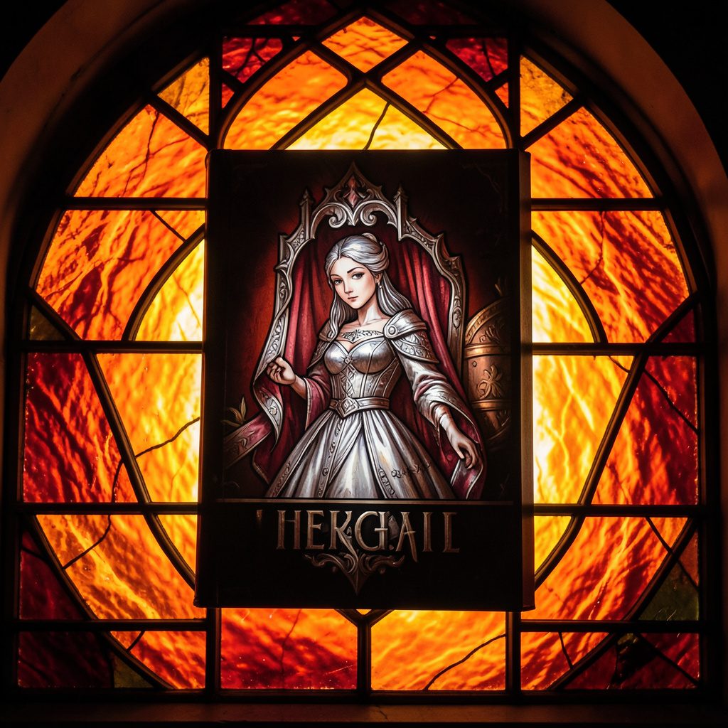
Selected works from across our quarterly issues, gathered into a printed volume. Past print runs have appeared in limited quantities and are available while supplies last.
Volumes cover poetry, short fiction, photography, paintings, drawings, reviews, and interviews — curated to reflect the breadth of artists who have shared their paths in the journal.
Browse Past IssuesInside the Pages
Since 2011, Stone Path Review has hosted contributions from more than twenty artists — poets, photographers, musicians, and filmmakers — along with interviews, readings, and film entries.
Recent volumes have included poetry from Mark Doty and Jim Harrison, an interview with a jazz musician from Minneapolis, MN, and the short film Efflorescence from Deep Field Cinema.

From the Blog
An all-star cast assembled for the fall issue — poetry, short stories, photography, and an interview with a jazz musician from Minneapolis, MN.
Read More →
A featured film entry from Deep Field Cinema, programmed as part of our ongoing screen series.
Read More →
418 Publishing, Inc. was started as the parent company of Stone Path Review, with five issues published by this point.
Read More →
Photography and artist interview, part of an ongoing series highlighting new and established contributors.
Read More →
A recorded poetry reading captured on video and shared alongside the print issue.
Read More →
Browse past quarterly issues of Stone Path Review, available online with limited print quantities.
Read More →