
Events
Fall Issue Update
An all-star cast assembled for the fall issue — poetry, short stories, photography, and an interview with a jazz musician from Minneapolis, MN.
Read More →An Artistic Journal · Est. October 2011
A quarterly publication — online and in print — joining poets, photographers, painters, storytellers, and musicians into one open forum for cross-cultural expression.
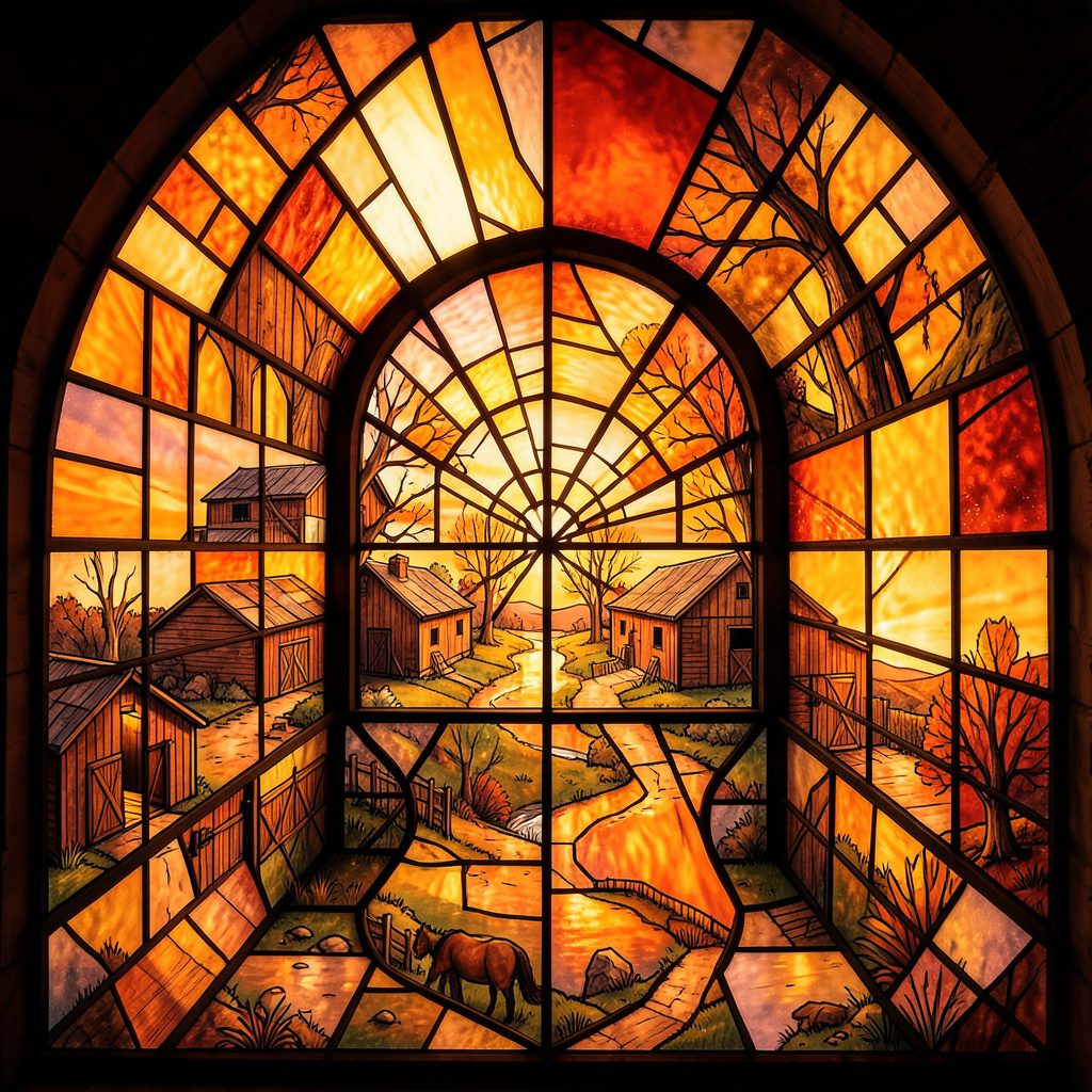
Colour in modern painting is never merely decorative. A red field can evoke blood, land, warning or ceremony; a pale blue may suggest distance, privilege, water or grief. Artists choose pigments within histories shaped by empire, industry, religion, migration and trade, then viewers bring their own memories to the encounter. The painted surface becomes a place where private feeling meets public meaning. Learn more about Dimelaneta.com.
This is especially apparent in Australia, where colour carries the memory of ochre, eucalyptus, saltbush, desert light and coastal weather, while also reflecting imported European traditions and contemporary global markets. A work shown in Melbourne may be read through the collections of the National Gallery of Victoria, while a painting exhibited in Sydney enters a different conversation shaped by the harbour, the Biennale and the city’s dense cultural mix.
The politics of colour also concerns access. Who can afford rare pigments? Whose visual language is treated as sophisticated? Which colours are collected, reproduced and preserved, and which are dismissed as commercial, childish or merely popular? These questions reach beyond the studio into museums, auction rooms, design culture and the everyday images that organise social life.
For a journal devoted to poetry, fiction, criticism and visual art, colour offers a shared vocabulary across forms. A photograph can complicate a painter’s palette, a poem can name a shade that resists visual description, and an essay can expose the histories hidden inside an apparently simple hue. The result is a richer account of painting as both aesthetic experience and civic language.
Every colour arrives with material baggage. Ultramarine was once made from lapis lazuli imported from Afghanistan and priced as a luxury, while synthetic pigments changed the economics of painting during the industrial era. Cadmium yellow and red offered striking intensity but carried concerns about toxicity. Modern artists therefore worked with substances shaped by mining, chemistry, labour and international commerce.
The history of colour is also a history of patronage. Religious institutions, monarchies and wealthy collectors could demand expensive blues, golds or purples, giving those hues an authority that was partly financial. Later, advertising and mass production made brilliant colours widely available, yet the old association between rarity and prestige did not disappear. Contemporary galleries still attach value to certain materials, techniques and lineages.
Looking at a painting politically means asking what its palette conceals. A mineral blue may imply technological progress while obscuring extraction. A green landscape may promise abundance while ignoring dispossession. Even a restrained monochrome can signal seriousness because modernist institutions taught viewers to associate reduced colour with intellectual depth.
Colour persuades before language has time to intervene. Red can command attention in a protest banner, a national emblem or an abstract canvas. Blue has been used to imply calm, corporate reliability and spiritual elevation, though it can equally describe melancholy, police presence or the unstable horizon of a warming sea. These associations are not fixed, but they are powerful because communities repeat them.
Modern painters often exploit that instability. Mark Rothko’s large colour fields invite contemplation, yet their solemn scale depends on the museum’s authority and the viewer’s willingness to treat colour as profound. In other contexts, saturated colour has been labelled excessive or sentimental, particularly when linked to popular culture, craft traditions or artists working outside established institutions.
The judgement of a palette can reveal social prejudice. A bright, decorative surface may be criticised as unserious when it draws from domestic interiors, textiles or vernacular signs, even as similar intensity is celebrated in a canonical male painter. Feminist and postcolonial artists have challenged these hierarchies by making colour carry anger, pleasure, memory and embodied knowledge without translating those experiences into approved forms of restraint.
Australian painting has long been shaped by an argument about light. The sharp brightness of the continent, the dry interiors and the shifting colours of the coast have encouraged artists to move between observation and myth. Yet the familiar palette of ochre, rust, turquoise and dusty green can become a commercial shorthand when separated from the cultural knowledge of the places it appears to describe.
For First Nations artists, colour may be bound to Country, kinship, ceremony and cultural authority rather than serving as an open vocabulary available to anyone. Ochre is not simply an earthy alternative to imported paint; in many communities it is connected to place, law and continuity. Viewers and institutions have a responsibility to understand cultural protocols rather than treating Indigenous colour systems as an attractive visual style.
The politics becomes visible in exhibitions across cities such as Melbourne, Sydney and Brisbane, where audiences encounter very different forms of Australian modernity. A gallery may hang a geometric abstraction beside a work grounded in Country, creating productive connections or flattening significant distinctions. Curatorial language, wall placement and collection history all influence whether colour is encountered as living knowledge or reduced to national branding.
Art markets often reward visual identities that can be recognised quickly. A distinctive palette helps a painter build a signature, enabling dealers, critics and collectors to describe a body of work in a few memorable words. In Australia, this can be seen in the relationship between commercial galleries, art fairs and auction houses in Sydney and Melbourne, where established names receive greater visibility and price stability.
That system encourages repetition. Collectors may seek the “blue period”, the desert series or the luminous coastal paintings because a familiar colour language reduces uncertainty. Aesthetic preference becomes financial expectation. The market may then support works that fit an artist’s existing brand while making experimentation appear risky, particularly for emerging painters who cannot easily absorb a failed sale.
The local market is also shaped by practical realities. Shipping large canvases between Perth, Adelaide and the east coast is expensive, storage costs are substantial, and public collections compete with private buyers for influential works. Online viewing rooms have widened access, yet screens alter saturation and scale. A painting that appears brilliantly red on a phone may feel darker and more complicated when seen in a gallery.
Digital images have transformed how paintings circulate. A colour can be adjusted by a camera, compressed by a platform or altered by a viewer’s display, making reproduction part of the work’s public life. Artists now anticipate photographs, installation views and social media thumbnails, while audiences often meet a painting online before encountering its physical surface.
Public space adds another layer. In Sydney, painted hoardings, transport signs and illuminated advertising compete for attention through carefully engineered palettes. In Melbourne, laneway murals and festival installations can turn colour into a sign of urban creativity, yet they may also participate in redevelopment campaigns that make neighbourhoods attractive to investors. Colour can celebrate community while being recruited into gentrification.
Advertising understands this power very well. Fast-food brands, political campaigns and property developers use colour to create speed, trust, warmth or urgency. Painters who borrow these strategies can expose how visual persuasion works, but they can also be absorbed by the same economy of attention. The boundary between critique and participation is often deliberately unstable.
Abstract painting is frequently described as free from narrative, but freedom is never distributed equally. A field of white may recall spiritual purity to one viewer and colonial architecture to another. Black may function as formal depth, mourning, resistance or racialised symbolism. Geometry can imply universal order while quietly inheriting the authority of European modernism.
This does not make abstraction politically limited. It makes its conditions worth examining. Artists can use non-representational form to resist propaganda, interrupt familiar images or create experiences that cannot be reduced to a single message. Colour can remain open without becoming empty, provided viewers acknowledge the histories that shape their responses.
Critical writing helps sustain that complexity. A thoughtful review does not dictate what a painting must mean; it follows the pressure points between intention, material and reception. Readers can compare an artist’s stated ideas with the pigments, scale and exhibition context, asking who is invited into the work and who may feel excluded by its assumptions.
The international conversation around colour benefits from platforms that place visual art beside other forms of expression. A publication’s journal masthead can reveal the range of editors and contributors involved in shaping that conversation, reminding us that interpretation is collaborative rather than produced by a single authoritative voice.
Colour words do not travel cleanly between languages. A term that names a precise shade in one culture may have no direct equivalent in another, while a colour associated with mourning in one community can signify celebration elsewhere. Translation therefore involves more than replacing vocabulary; it requires attention to ritual, landscape, history and power.
International art exhibitions often promise cultural exchange, but exchange can become extraction if a local palette is detached from its makers. A gallery may borrow the visual vocabulary of a region while giving little space to its artists, languages or political claims. Responsible presentation includes provenance, consultation and context, not just an appealing wall of colour.
Cross-cultural work can still create genuine encounter. Artists may combine inherited materials with industrial paint, or place local colour systems into dialogue with global abstraction. The strongest examples do not erase difference in pursuit of a universal style. They allow viewers to notice where meanings overlap, where they conflict and where an image remains deliberately unresolved.
Online journals can widen that field by publishing artists and writers from different places without requiring the resources of a major exhibition circuit. The publication’s mission describes an open forum grounded in cross-cultural artistic expression, a useful model for thinking about colour as conversation rather than ownership.
To look politically is not to abandon pleasure. Sensuous colour can still delight, disturb and console. The task is to add attention to that response: to notice the material, the labour, the cultural references and the institutions that make the encounter possible. A painting becomes more vivid when its beauty is allowed to coexist with difficult questions.
Australian viewers can practise this in familiar settings, from a major gallery in Canberra to a regional exhibition in the Riverina or a community arts space in Darwin. They can ask why certain palettes are called timeless, why some artists are marketed through landscape, and how First Nations cultural authority is represented. They can also notice their own habits: the colours they trust, reject or immediately associate with home.
The conversation continues across print and digital pages. Readers can browse past issues for criticism and visual work that place painting beside poetry, photography and other media. Artists with a developed body of work may also explore the journal’s open, fee-free submission culture, where colour can enter a wider exchange without being filtered solely through commercial value.
Bring your own close reading to that exchange. Spend time with a painting before naming it, follow the histories behind its pigments, and support artists whose palettes complicate easy stories about place, identity and taste. Share work that makes colour feel newly charged, and let the conversation move between studio, gallery, screen and page.
Identity & Recognition
Featured Book
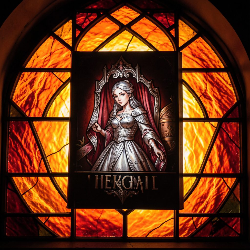
Selected works from across our quarterly issues, gathered into a printed volume. Past print runs have appeared in limited quantities and are available while supplies last.
Volumes cover poetry, short fiction, photography, paintings, drawings, reviews, and interviews — curated to reflect the breadth of artists who have shared their paths in the journal.
Browse Past IssuesInside the Pages
Since 2011, Stone Path Review has hosted contributions from more than twenty artists — poets, photographers, musicians, and filmmakers — along with interviews, readings, and film entries.
Recent volumes have included poetry from Mark Doty and Jim Harrison, an interview with a jazz musician from Minneapolis, MN, and the short film Efflorescence from Deep Field Cinema.

From the Blog
An all-star cast assembled for the fall issue — poetry, short stories, photography, and an interview with a jazz musician from Minneapolis, MN.
Read More →
A featured film entry from Deep Field Cinema, programmed as part of our ongoing screen series.
Read More →
418 Publishing, Inc. was started as the parent company of Stone Path Review, with five issues published by this point.
Read More →
Photography and artist interview, part of an ongoing series highlighting new and established contributors.
Read More →
A recorded poetry reading captured on video and shared alongside the print issue.
Read More →
Browse past quarterly issues of Stone Path Review, available online with limited print quantities.
Read More →