Events
Fall Issue Update
An all-star cast assembled for the fall issue — poetry, short stories, photography, and an interview with a jazz musician from Minneapolis, MN.
Read More →An Artistic Journal · Est. October 2011
A quarterly publication — online and in print — joining poets, photographers, painters, storytellers, and musicians into one open forum for cross-cultural expression.
The slow thud of a Vandercook platen, the metallic smell of oil-based ink, the careful alignment of type by hand—letterpress poetry is a craft that refuses to be rushed. Once the dominant method of producing literary work in the English-speaking world, the technique has receded into a niche art form practised by a small, devoted community. Yet across Australia, a quiet revival is taking shape in studios tucked behind laneway galleries in Melbourne, in community workshops in Redfern, and in regional print rooms in Hobart.
This resurgence sits at a fascinating crossroads between fine art, literature, and slow craft. As digital publishing saturates everyday reading, a growing number of Australian poets are returning to the physical letterform, treating each broadside and chapbook as a one-of-a-kind object. The form invites writers to slow down, revise with the typecase in mind, and consider white space as carefully as the words themselves.
Letterpress printing, the technique of pressing inked type onto paper using a mechanical press, shaped literary culture for nearly five centuries. From the Gutenberg Bible through to the mid-twentieth century, poems, pamphlets, and fine editions passed through metal or wood type before reaching readers. In Australia, the tradition took root in the gold rush era, when small-town newspapers in Ballarat and Bendigo used hand-operated presses to print verse alongside shipping news and sporting fixtures.
By the 1920s, hot-metal typesetting had become standard in commercial printing across Sydney and Adelaide. Poets of the modernist period, often working through small imprints like the Sydney-based Endeavour Press, saw their work appear in limited runs that prized craftsmanship over mass distribution. The tactile qualities of impressed type, the slight shadow where the paper met the lead, became part of the reading experience itself.
The post-war decades brought offset lithography and then desktop publishing, both of which undercut the economic foundations of letterpress. Print runs that once required thousands of copies to justify setting type could now be produced digitally for almost nothing. Many Australian print rooms, including the historic Government Printing Office in Canberra, decommissioned their metal-type equipment by the 1980s.
The cultural shift was just as significant as the economic one. Poetry itself moved toward formats that prioritised legibility and speed. Workshops and print studios closed, their cabinets of type sold off or melted down. For a generation, letterpress existed mainly as a museum curiosity, occasionally demonstrated at the Powerhouse or the National Library of Australia rather than practised as a living craft.
What draws contemporary poets back to the iron press is something the screen cannot replicate: physical presence. A letterpress poem carries an indentation, a texture, a faint debossed shadow where the type kissed the paper. When held at an angle to the light, the impression reveals the labour of its making. This tactile dimension is not mere nostalgia; it reshapes how readers engage with the text.
Poets working in this medium often speak of revision as a different kind of discipline. Setting a poem in lead requires committing to its final shape because every alteration costs time and metal. The constraint encourages compression, precision, and an awareness of the page as a composed object. Several Sydney-based poets have noted that working on a press forces them to treat each line break as a structural decision rather than a stylistic flourish.
The current revival is visible in pockets across the country. In Melbourne, studios operate out of converted warehouses in Collingwood and Fitzroy, offering workshops that pair novice printers with established poets. Brisbane's grassroots scene has produced a wave of zine fairs where letterpress broadsides sit alongside risograph prints and ceramic objects. Hobart's Salamanca Arts Centre hosts occasional press days where local writers print single-sheet poems on a restored Albion press.
Community organisations have also played a role. The State Library of Victoria maintains a working press that visiting artists can book by appointment, while regional galleries in towns like Castlemaine and Daylesford run seasonal residencies. These spaces are deliberately porous, encouraging collaboration between printers, visual artists, and writers. The result is a uniquely Australian hybrid: poetry chapbooks that combine text with linocut, photopolymer, and sometimes Indigenous design motifs, bridging traditions that rarely meet in commercial publishing.
The following comparison highlights key differences between letterpress poetry production and contemporary digital publishing, particularly as they relate to small literary journals.
| Aspect | Letterpress poetry | Digital publishing |
|---|---|---|
| Setup time | Hours to days per page | Minutes per page |
| Unit cost | High; decreases with edition size | Low; largely fixed |
| Tactile quality | Distinct impression, texture | Flat, screen-like |
| Edition size | Typically 50–300 copies | Unlimited |
| Reader engagement | Slow, object-based | Rapid, scroll-based |
| Environmental impact | Reusable metal type, recycled paper | Energy-heavy servers, e-waste |
| Archival longevity | Centuries if properly stored | Dependent on file formats |
For a quarterly journal like Stone Path Review, the contrast highlights why both formats can coexist. The publication's online issues reach global readers, while limited-run print editions allow contributors to experience their work as physical artefacts.
Writing for letterpress requires a different set of considerations than drafting for a literary magazine. Poets must think in terms of type size, leading, and the way a stanza will sit on the page when justified. The brevity of the broadside format, often an A3 sheet, demands distillation. Many Australian poets now draft directly with the press in mind, treating the act of composition and the act of printing as a single, extended gesture.
Practical pathways for those interested in the form are growing. Several universities, including the University of Melbourne and RMIT, now offer short courses in book arts that include letterpress modules. Independent studios such as the Newcastle Printmakers Workshop run open-access days where aspiring poets can pull their own sheets. For those submitting work to publications that still print on press, reading the submission guidelines carefully has become essential, as many presses now specify preferred dimensions, paper weights, and ink coverage.
Letterpress poetry will never replace the speed and reach of online publishing, nor should it try. What it offers instead is a counterweight, a reminder that literature can be made with the hands, that reading can be slow, and that the page itself can be a site of meaning. For Australian poets and readers curious about where their craft might go next, the press remains a generous teacher. Those interested in contributing work or learning more about upcoming print editions can reach out through the editorial team, who can advise on submissions, residencies, and collaboration opportunities.
Identity & Recognition
Featured Book
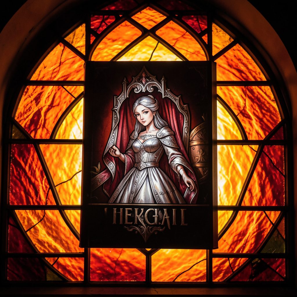
Selected works from across our quarterly issues, gathered into a printed volume. Past print runs have appeared in limited quantities and are available while supplies last.
Volumes cover poetry, short fiction, photography, paintings, drawings, reviews, and interviews — curated to reflect the breadth of artists who have shared their paths in the journal.
Browse Past IssuesInside the Pages
Since 2011, Stone Path Review has hosted contributions from more than twenty artists — poets, photographers, musicians, and filmmakers — along with interviews, readings, and film entries.
Recent volumes have included poetry from Mark Doty and Jim Harrison, an interview with a jazz musician from Minneapolis, MN, and the short film Efflorescence from Deep Field Cinema.
From the Blog
An all-star cast assembled for the fall issue — poetry, short stories, photography, and an interview with a jazz musician from Minneapolis, MN.
Read More →
A featured film entry from Deep Field Cinema, programmed as part of our ongoing screen series.
Read More →
418 Publishing, Inc. was started as the parent company of Stone Path Review, with five issues published by this point.
Read More →
Photography and artist interview, part of an ongoing series highlighting new and established contributors.
Read More →
A recorded poetry reading captured on video and shared alongside the print issue.
Read More →
Browse past quarterly issues of Stone Path Review, available online with limited print quantities.
Read More →