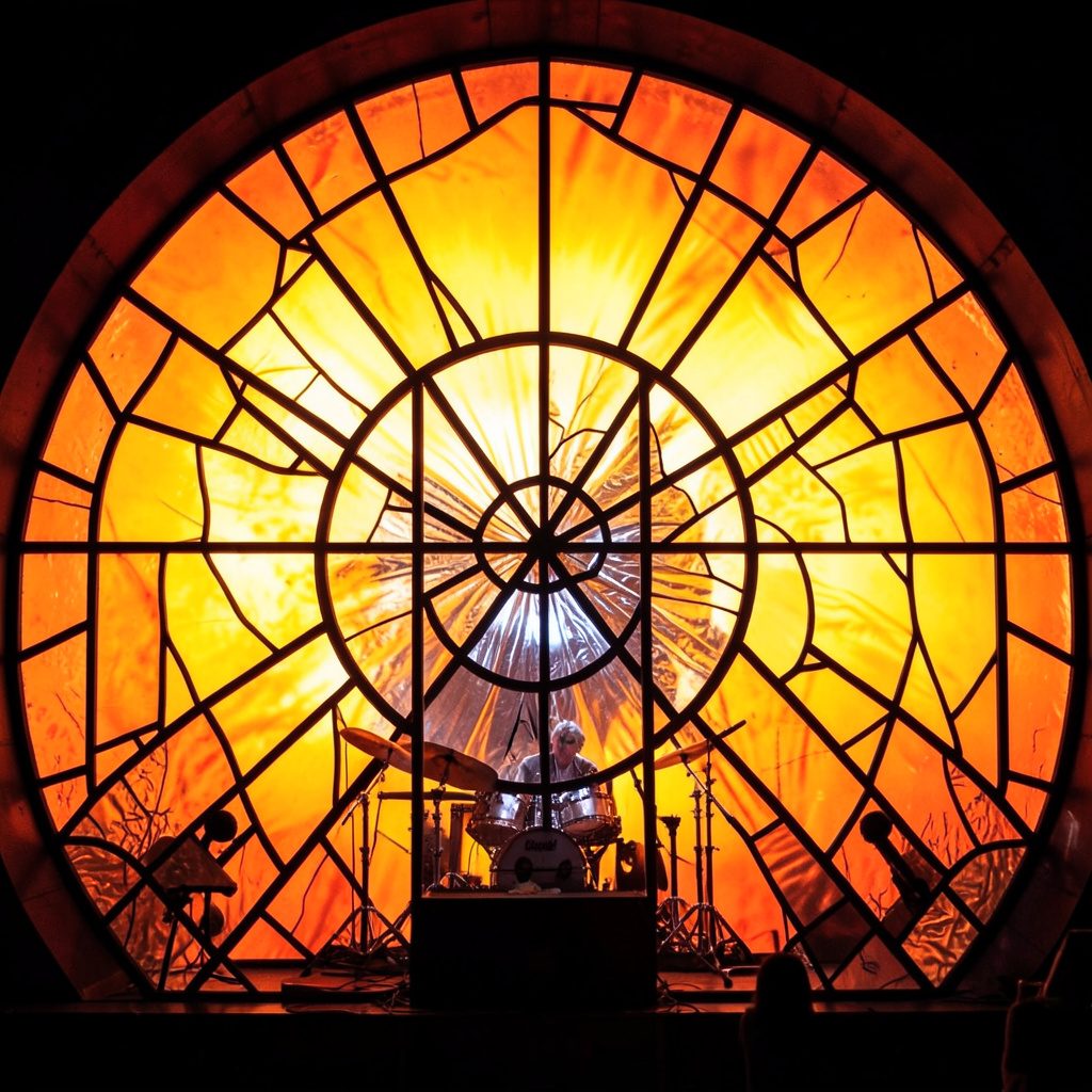
Events
Fall Issue Update
An all-star cast assembled for the fall issue — poetry, short stories, photography, and an interview with a jazz musician from Minneapolis, MN.
Read More →An Artistic Journal · Est. October 2011
A quarterly publication — online and in print — joining poets, photographers, painters, storytellers, and musicians into one open forum for cross-cultural expression.
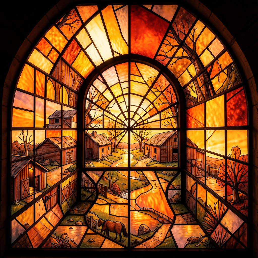
Before a painting shows a recognisable subject, it contains a sequence of quiet decisions: the choice of linen or cotton, the tension of the cloth, the colour of the ground, and the order in which materials meet. Preparing a canvas is practical work, yet it can also become a personal ritual that steadies attention and gives an image somewhere to begin.
For painters in Australia, that preparation responds to local conditions as much as artistic preference. A studio in Melbourne may need to account for winter damp, while a workspace in Perth or Adelaide may contend with dry air and fine dust. The preparation becomes a kind of recipe: measured enough to repeat, flexible enough to accommodate weather, memory, and instinct.
A painter’s first ritual is often clearing a working surface. The floor is swept, jars are rinsed, rags are separated from clean cloths, and the canvas is placed where it can be approached from several directions. In a compact Sydney studio, this may mean folding an easel away from the dining table. In a regional shed, it may mean protecting wet materials from windblown grit and sudden temperature changes.
Good preparation also includes safety. Solvent containers should remain closed when not in use, oily rags need careful storage, and ventilation matters when using primers, varnishes, or mineral spirits. Australian painters working in shared buildings should follow relevant workplace health and safety guidance rather than treating studio habits as harmless tradition. A ritual is useful when it protects concentration without creating avoidable risk.
Some artists begin with silence; others use radio, field recordings, or a carefully chosen playlist. The important element is repetition. Placing the same palette knife beside the same jar each morning can mark a transition from ordinary time into studio time. These small gestures make the blank support feel less like a demand and more like an invitation.
Canvas is not a neutral rectangle. Cotton has a softer, more absorbent character, while linen often carries a pronounced weave and a responsive spring. A painter runs a hand across the surface, checks the back for loose threads, and looks for irregularities that may become part of the finished image. The material can suggest whether the first marks should be thin and fluid or dense and deliberate.
Pre-stretched canvases offer convenience, particularly for artists working towards a local market where several consistent sizes are expected. A painter preparing work for weekend markets in Brisbane or a gallery delivery in Melbourne may value a reliable format that can be framed and transported efficiently. Stretching linen by hand, however, creates a closer relationship with the object. The sound of tack or staple entering the stretcher becomes part of the process.
Before applying anything, many painters make a small test on a scrap of the same fabric. This reveals how quickly the cloth absorbs water or oil, whether the weave remains visible, and how a proposed ground will alter the colour. The test may take five minutes and save an entire afternoon. It also encourages the artist to treat mistakes as information rather than failure.
Visual references can enter at this stage. Packaging, signage, old catalogues, and digital images may provide colour structures or lettering ideas. Even a page of scores4free results can spark thoughts about numerical rhythm, repeated symbols, or the visual tension of competing marks without becoming a literal source image.
Sizing and priming are different jobs. A size can seal and protect fibres, while a primer creates the working surface that receives paint. Traditional oil grounds and modern acrylic gessos behave differently, so the painter chooses according to the intended medium, finish, and drying time. Oil paint generally requires a properly prepared surface, while acrylic gesso offers a versatile base for acrylic, mixed media, and many drawing materials.
The colour of the ground quietly influences every later mixture. White creates luminosity and separation. Warm ochre, pink, or pale red can make shadows vibrate. A grey ground may calm a bright palette and help the painter judge values early. Some artists wipe the ground back unevenly, allowing patches of it to remain visible as a unifying undertone.
Application is a recipe with room for judgement. A thin coat is brushed or rolled across the support, allowed to dry, then lightly sanded if a smoother surface is wanted. Several thin layers are usually easier to control than one heavy coat. The painter may change direction with each layer, creating an even tooth or leaving subtle movement in the surface.
The Australian climate can alter the timing. A water-based ground may dry rapidly during a hot Perth afternoon, while a cool, humid day in Hobart may extend the waiting period. Rather than relying on a fixed clock, the painter tests the surface with a fingertip or the edge of a clean tool. Dryness is a physical fact, not merely a timetable.
A colour recipe begins with restraint. Instead of loading the palette with every available tube, a painter may select a warm and cool version of each primary, plus white and an earth pigment. This limited palette encourages mixtures that belong together. A little ultramarine, burnt sienna, and titanium white can produce a surprising range of greys, violets, and quiet browns.
Medium changes the movement of paint. Linseed oil can increase flow and richness; an alkyd medium may shorten drying time; water can alter the handling of acrylic. The painter records proportions in a notebook, especially when a surface needs to be completed over several sessions. These notes are less about scientific precision than returning to a state of balance after interruption.
Unexpected colour sources can also sharpen visual thinking. An artist researching neon signs, gaming rooms, or printed ephemera might study the terminology collected in a casino language guide, not to imitate its subject matter but to notice how specialised words, abbreviations, and symbols organise attention. Such research can lead to paintings built around coded marks, grids, or saturated contrasts.
The recipe is never entirely fixed. A painter may scrape back a muddy mixture, add a transparent glaze, or place a dry brush across a tacky passage. The aim is not perfect consistency. It is a dialogue between measured ingredients and the changing needs of the image.
Drying is an active part of painting. During the pause, the artist steps away, turns the canvas towards a different light, or examines it in a mirror. Distance reveals problems that close looking conceals: a shape that has become too dominant, a passage lacking air, or a colour that has lost its intended temperature.
Layering also creates a form of timekeeping. A thin stain may establish atmosphere, a more opaque passage may describe structure, and a final scumble may soften the boundary between them. Each layer should have enough breathing room to remain legible. Rushing can trap unwanted moisture or disturb an underlayer that has not settled.
The pause provides an opportunity to consider presentation. If the painting is destined for an Australian gallery, the artist may check the work under warm and cool lighting, measure the stretcher accurately, and calculate packaging costs. Painters selling directly also need to account for materials, labour, transport, and whether GST registration affects pricing. The commercial reality does not diminish the ritual; it gives the finished object a route into public life.
A finished canvas carries evidence of its making: a softened edge, a visible ground, a fingerprint near the stretcher, or a section deliberately left unresolved. Stone Path Review offers an open forum for this kind of cross-disciplinary attention, bringing visual art into conversation with writing, photography, music, and moving image through its online journal.
| Preparation choice | Surface effect | Useful when |
|---|---|---|
| White acrylic ground | Bright, direct colour and clear value contrasts | The painting depends on luminosity |
| Warm ochre ground | A cohesive, sunlit undertone | Earth colours and portraits need warmth |
| Grey ground | Softer colour relationships and easier value judgement | The composition relies on atmosphere |
| Sanded layered gesso | Smooth, controlled handling | Fine detail or thin glazes are planned |
| Lightly textured ground | Visible drag and broken marks | Gesture and material variation are central |
The most valuable habits are those that make the painter more observant. They need not be elaborate or expensive. A folded cloth, a handwritten colour note, or a five-minute drawing can establish continuity between sessions and prevent the blank canvas from becoming intimidating.
Artists who use printed references, labels, or small visual studies can turn preparation into an extension of the artwork. A test image can be printed onto adhesive stock, trimmed, and arranged beside the palette; this approach is explained in a practical guide to printing sticker labels. The result might be a temporary studio marker, a motif archive, or part of a mixed-media composition.
Useful rituals include:
These actions turn preparation into a repeatable language. They leave space for accidents while giving the painter a structure strong enough to carry uncertainty. The recipe remains alive because the hand, the weather, and the surface keep changing.
Artists wishing to share a finished painting, a studio essay, or a visual account of their working process can contact Stone Path Review. Submissions are welcomed without reading or submission fees, making the preparation itself part of a wider exchange between makers and readers.
Identity & Recognition
Featured Book
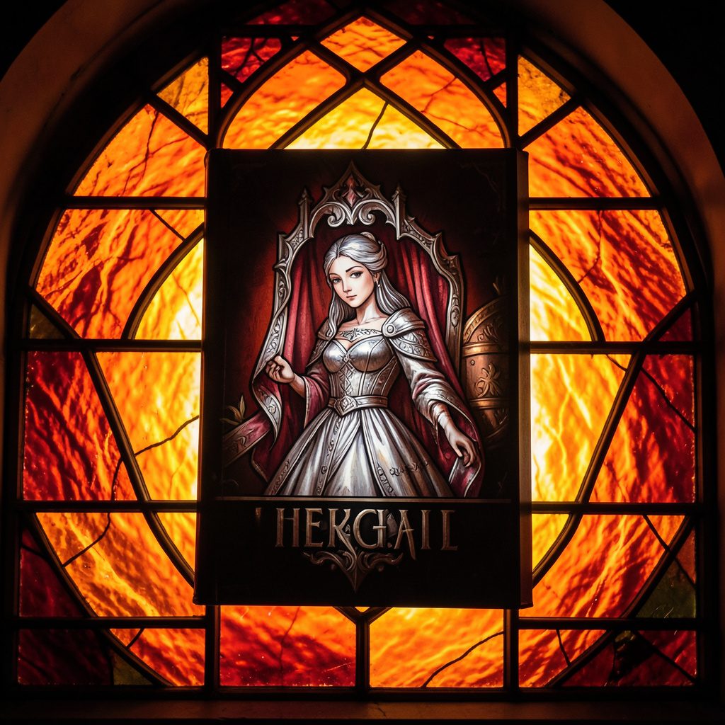
Selected works from across our quarterly issues, gathered into a printed volume. Past print runs have appeared in limited quantities and are available while supplies last.
Volumes cover poetry, short fiction, photography, paintings, drawings, reviews, and interviews — curated to reflect the breadth of artists who have shared their paths in the journal.
Browse Past IssuesInside the Pages
Since 2011, Stone Path Review has hosted contributions from more than twenty artists — poets, photographers, musicians, and filmmakers — along with interviews, readings, and film entries.
Recent volumes have included poetry from Mark Doty and Jim Harrison, an interview with a jazz musician from Minneapolis, MN, and the short film Efflorescence from Deep Field Cinema.
From the Blog
An all-star cast assembled for the fall issue — poetry, short stories, photography, and an interview with a jazz musician from Minneapolis, MN.
Read More →
A featured film entry from Deep Field Cinema, programmed as part of our ongoing screen series.
Read More →
418 Publishing, Inc. was started as the parent company of Stone Path Review, with five issues published by this point.
Read More →
Photography and artist interview, part of an ongoing series highlighting new and established contributors.
Read More →
A recorded poetry reading captured on video and shared alongside the print issue.
Read More →
Browse past quarterly issues of Stone Path Review, available online with limited print quantities.
Read More →