Events
Fall Issue Update
An all-star cast assembled for the fall issue — poetry, short stories, photography, and an interview with a jazz musician from Minneapolis, MN.
Read More →An Artistic Journal · Est. October 2011
A quarterly publication — online and in print — joining poets, photographers, painters, storytellers, and musicians into one open forum for cross-cultural expression.
What looks stable at first glance can change whenever light, texture or a neighbouring colour shifts. Grey can feel quiet, severe, misty, industrial or tender. Treating it as empty space rather than as a colour in its own right narrows its expressive range. The most convincing paintings of it usually come from close observation, deliberate mixing and patient revision. Learn more about Naurua Herättävä Testi Osaatko Arvata Kuka Tämä Naapuri On.
Across Australia, the subject is practically everywhere: cloud over Melbourne, silver eucalyptus in the Blue Mountains and hard noon light in Perth. Painters also meet it at the practical level, selling through open studios, artist-run spaces and consignment galleries while buying pigments, boards and framing across long distances. Grey is therefore both a working material and an economic reality, requiring decisions from the first mixing to the moment a finished painting reaches its audience.
Grey becomes most useful when it is treated as a relationship rather than a fixed tube colour. A warm grey beside terracotta can suggest dust or late afternoon; a cool grey beside deep blue can suggest rain, distance or steel. Before naming either mixture, test its value against the canvas and the darkest and lightest marks nearby. If every local passage holds together, the grey is acting as structure rather than emptiness.
Many painters reach for black and white because they are familiar, then complain that their neutral passages look chalky. The answer is often a third colour: raw sienna, yellow ochre, ultramarine or burnt umber. These pigments pull a mixture toward warmth or coolness and reveal how little is needed to keep it alive. Transparent layers can deepen a quiet grey, while opaque touches of white restore light without repainting the whole field.
Stone Path Review encourages that openness: its current issue archive places visual work beside poems, fiction, music and video, reminding the painter that colour can carry rhythm and narrative. A slow grey might answer a sharply cut sentence or share a cadence with a cello. Reading or viewing across disciplines can reveal applications that a narrowly technical exercise would miss.
A limited palette makes decisions visible. Begin with a strong white, a soft black and two earth colours, then add one cool and one warm blue only if they solve a problem. Mix in small patches rather than on the palette knife, and label warm and cool families with separate brushes. The aim is not laboratory purity. It is control: when a passage looks dead, the painter should know which pigment or excess water caused it.
Water changes grey more than most beginners expect. A dilute wash can settle into canvas weave and appear unexpectedly blue or brown, while a thick mixture can sit grey when viewed closely and luminous from across the room. Test opacity, granulation and drying behaviour on the same primed board. Use glazing to shift an established layer and scumbling to soften a dry one, but keep a clean note of each mixture for later corrections.
Five habits make a grey study easier to judge and more useful to carry into a finished painting:
Treat the routine as a set of comparisons, not a recipe. The palette should stay flexible enough to respond to the subject, the weather and the support. A convincing neutral is often assembled rather than found, and revision is part of making it.
Light determines which grey a viewer believes. Melbourne’s cloud-filtered light softens edges and can make a restrained palette feel luminous, while direct summer sun creates sharper divisions and harder shadows. Perth’s bright light demands deeper darks if the artist wants a pale wall to hold its shape. The same mixture photographed at noon and under a shaded verandah may read as silver and slate.
Place matters as much as weather. In the Blue Mountains, layered eucalyptus and distant ridgelines produce blue-grey intervals that no single tube can supply. Inland, pale rock and dry scrub create dusty greys that shift toward ochre in the afternoon. Painting these places is not merely copying local colour; it is watching atmosphere reorganise a scene.
Train the eye before reaching for another pigment. Study one wall for ten minutes and name what changes as cloud crosses it. For a comic change of pace, a playful neighbour quiz asks readers to infer a stranger from visual clues; the useful lesson is that first impressions are hypotheses. Roof paint, paving, bins, reflected windows and plant shapes can all revise the colour a painter thought they had seen.
Observation becomes painting through structure. Decide which shapes carry the composition, then let secondary detail soften rather than compete. A pale vertical might hold the eye in a Melbourne laneway; a broad horizontal could steady a view from the Blue Mountains. Negative space is not unused space, especially in muted work: each quiet passage influences the temperature and pressure of the marks beside it.
Move between direct painting and constructed work. A plein-air study can record the arrangement of light, while the studio can expand it into a larger, slower rhythm. Keep the original sketch even if its colour is rejected. Its awkward edges and accidental notes may reveal a spatial problem that a polished drawing hides. Thinned paint, dry brush, pencil and erasure each answer a different question, so changing tools can reset a stuck passage.
Materials also require boundaries. Tubes of heavy-body grey, a primed board and professional framing can consume a modest project budget quickly, especially when postage crosses Australia. The reserve-setting logic in craps bankroll guidance offers a useful analogy, though the activities are unrelated: decide in advance what can be spent, keep essential supplies separate, and treat experiments as planned costs rather than accidental losses.
The Australian market for contemporary work is varied, so a muted series may need several routes. Melbourne open-studio weekends put work directly before collectors; artist-run spaces around Australia often prioritise sustained relationships over passing trade. Adelaide’s SALA Festival adds a strong calendar event, while commercial galleries can provide curatorial support and consignment. Direct sales can reward initiative, but they leave the artist responsible for pricing, receipts, insurance and follow-up.
Genre matters too. A limited edition of grey prints can suit a domestic wall, whereas a large painting may need a site-responsive buyer. If the colour language is subtle, good photographs and a concise statement become part of the sales material. Frame choices should protect the work without turning it into a generic decor object. Allow for freight between states and to regional centres, work in progress and the slow rhythm of payment plans when preparing a price.
Artists under financial pressure may be tempted to treat a side activity as dependable income. A guide to mobile baccarat in Australia should be read for what it is: entertainment with risk, not a substitute for a properly priced studio practice. The same clear accounting belongs in the studio ledger, where materials, freight and unpaid hours make the true cost of a painting visible.
Language shapes reception too. During an open-studio arvo, a visitor may say, “Have a look at this one,” then offer blunt praise or quiet uncertainty. Grey work benefits from conversation that goes beyond “nice” or “different”: which area holds the light, where the temperature shifts, and why the restrained palette fits the subject. Questions can sound like critique in a formal gallery, but around a studio table they often lead to the most productive exchange.
Presentation can give a quiet painting a public life without making it louder. Choose a title that acknowledges mood, place or process without explaining every mark. In a group exhibition, give neighbouring artists’ work enough physical space for its own silence. Online, reproduce the piece under consistent light and retain the shadows or texture that a compressed image removes. A short written reflection can open a door for viewers who enter through language before colour.
Stone Path Review is suited to that wider conversation because it treats visual art, writing, music and moving image as parts of one cultural forum. A painting shown beside an essay or performance can meet readers in different ways, while a work from another country can reveal the universality of muted light without flattening local references. The journal accepts submissions from creators around the world and does not charge reading or submission fees.
Choose one finished work that uses restriction with intention, write a short note on the palette, place or process that shaped it, and submit it to Stone Path Review. Share a quiet image with readers looking for cross-cultural artistic exchange, and let a measured colour begin a generous exchange.
Identity & Recognition
Featured Book
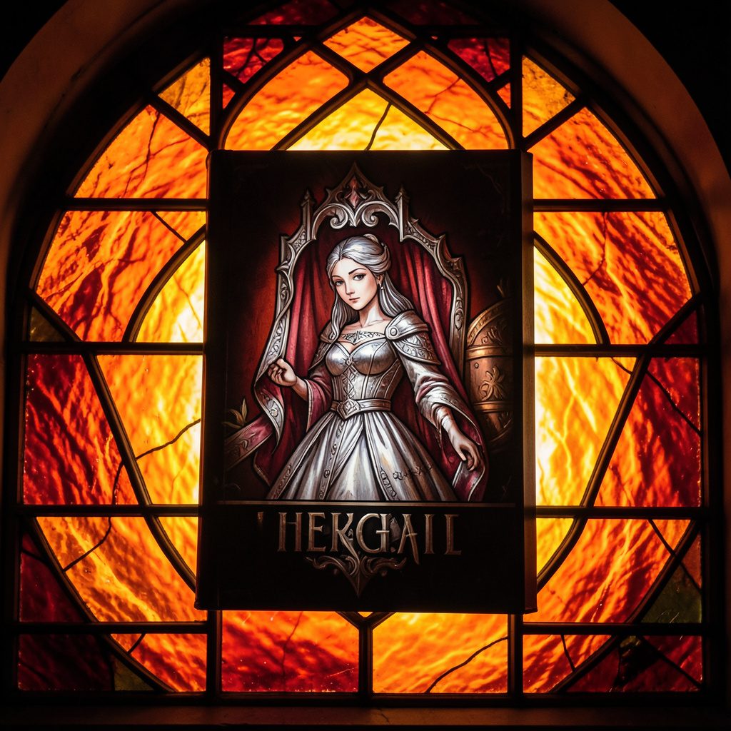
Selected works from across our quarterly issues, gathered into a printed volume. Past print runs have appeared in limited quantities and are available while supplies last.
Volumes cover poetry, short fiction, photography, paintings, drawings, reviews, and interviews — curated to reflect the breadth of artists who have shared their paths in the journal.
Browse Past IssuesInside the Pages
Since 2011, Stone Path Review has hosted contributions from more than twenty artists — poets, photographers, musicians, and filmmakers — along with interviews, readings, and film entries.
Recent volumes have included poetry from Mark Doty and Jim Harrison, an interview with a jazz musician from Minneapolis, MN, and the short film Efflorescence from Deep Field Cinema.
From the Blog
An all-star cast assembled for the fall issue — poetry, short stories, photography, and an interview with a jazz musician from Minneapolis, MN.
Read More →
A featured film entry from Deep Field Cinema, programmed as part of our ongoing screen series.
Read More →
418 Publishing, Inc. was started as the parent company of Stone Path Review, with five issues published by this point.
Read More →
Photography and artist interview, part of an ongoing series highlighting new and established contributors.
Read More →
A recorded poetry reading captured on video and shared alongside the print issue.
Read More →
Browse past quarterly issues of Stone Path Review, available online with limited print quantities.
Read More →